Responsive Adaptive Progressive impressive webpages
Marco Franssen
11 min read•2059 words

Loading...
Marco Franssen
In the last couple of years web applications technologies and frameworks went through a fast paced transformation and evolution. For all these evolutions there was coined a marketing term which (by coincidence) all end on …ive. So lets coin another one. In this article I'm going to explain you the basic concepts of all these principles which combined allow you to build an impressive web application.
It started all back in (from top of my head) late 2010, with the idea of having a webpage which renders properly on different screen resolutions, which was called Responsive Web Design (RWD) web development. It means based on the screen resolution the elements on your screen resize to have the best fit and user experience for you as the end user. Meaning it will use fluid, proportion-based grids, flexible images and css3 media queries. If you are not focusing on RWD by now you missed the boat already, but be brave and take a big leap and try to jump onboard.
I'm serious, Google started to boost search rankings since April 2015 based on RWD compatibility, so besides it gives an awesome UI and UX it also gives a boost to your SEO. As today majority of internet users are using a mobile device I wouldn't take this to light weight.
Also play around with resizing your browser now and see how my webpage renders and behaves differently as soon you start resizing your browser.
Getting nervous? Don't worry, further on I will give you some leads on how to start and what frameworks to use etc. combined with all the latest greatest new tech evolutions.
Probably you have also heard once about Adaptive Web Design (AWD), which in many articles on the web is explained like very similar to RWD and pretty often also mixed. The Term AWD was first coined early 2011. The main difference with RWD is that you would be using various templates for your webpage. One optimized for the mobile version of your webpage and a template for the desktop browser version of your webpage. This way you could load different assets (javascript, css, images) but also have a simpler DOM structure for your mobile version to have an improved loading speed. Although AWD could still be usefull for some scenarios I do think AWD is slowly becoming obsolete due to technological evolutions which I will explain in the next chapter.
Today if you are working on a web application and following latest development topics, it can't be the case you never heard about Progressive Web Apps (PWAs). Progressive Web Apps are fully supported in Google Chrome since April 2018. Progressive web apps are an enhancement of existing web technology. As such, they do not require separate bundling or distribution. Publication of a progressive web app is as it would be for any other web page. Therefore you can safely start to apply these enhancements without to much impact on compatibility with (legacy) other browser not supporting PWAs yet.
So what makes a PWA a PWA?
So now you probably are thinking How do I get such a impressive webpage. I have been using a Responsive Web Design since almost 5 years now. First using a Wordpress backend and later on I migrated my webpage to a static site engine hexo.js which had a port of my Wordpress theme available. So besides my webpage was responsive I figured performance wasn't to great due to a cheap server with cheap database and high traffic to my webpage. You probably also figure if you are using Wordpress you need a lot of plugins and things to get caching things etc. in place. So let me first introduce you to Static Site generators.
A static site engine generates the html pages for your webpage which you will then upload to a webserver. As a result there is no server side computation required when someone navigates to one of your pages neither any database queries. Resulting in blazingly fast performance and cheaper hosting costs to serve high traffic. A nice side effect is that most static site engines allow you to write your content in Markdown format. Which has a very low learning curve and gives the advantage to quickly produce content with markup which is a huge advantage compared to writing html. Unless you are using one of those WYSIWYG editors which quite often are buggy or messing with your markup as well.
So how do you do versions of your website and blog then?
That is a question I get very often, and the answer is very simple. Git!
Hereby a list of popular static site engines which I recall from the top of my head:
I'm open to update the list based on your comments. Looking forward to your contributions and findings.
First of all there is Google pagespeed. Google pagespeed can be triggered from the developer tools and gives you all kind of insights in web page loading speed and where to improve. Once you installed the Chrome extension you can use it via the developer tools.
Then there is also Google Lighthouse which is another plugin which also checks your webpage against PWA standards.
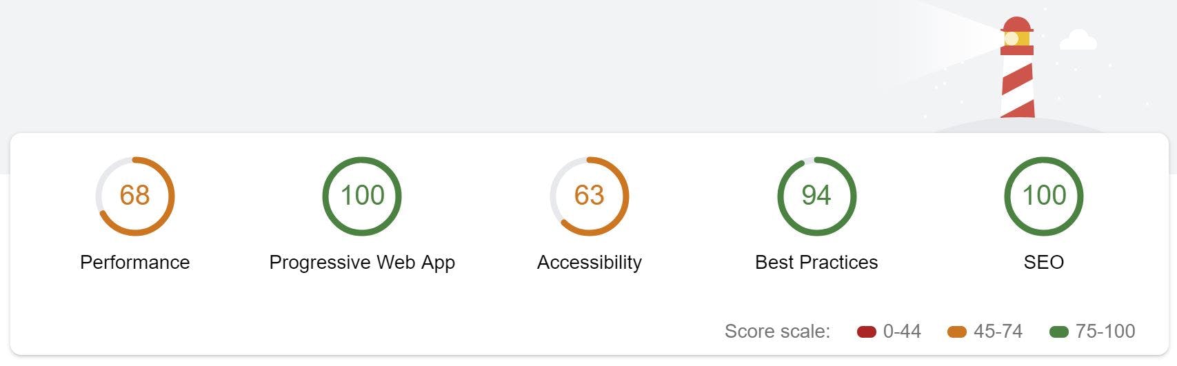
As you can see I also still have some improvement to go on my webpage performance wise. Most of this can be resolved in my theme or is related to thirdparty plugins in my theme. Try running both tools on my webpage. You will see there is still room for improvement on my webpage as well. Then run it on your own webpage and see where you can improve. There are some quick wins probably and some might take you some more time to resolve. In the next few sections I will explain some of the topics which show up in the tools.
By having your webserver return HTTP cache headers you can define where and for how long your content can be cached. You can control if your browser is allowed to cache the content and for how long, but you can also configure if a private cache server is allowed to cache your content. By doing so your webserver won't be hit that often and can therefore handle more load. On the other hand the User Experience of your web applications users will be better as they don't have to wait for downloading that image, JavaScript or css file again. Meaning the webpage will respond faster.
Defining caching policies for static assets is fairly easy to do by defining them in your webserver.
location ~* \.(?:manifest|appcache|html?|xml|json)$ {
  expires -1;
  # access_log logs/static.log; # I don't usually include a static log
}

# Feed
location ~* \.(?:rss|atom)$ {
  expires 1h;
  add_header Cache-Control "public";
}

# Media: images, icons, video, audio, HTC
location ~* \.(?:jpg|jpeg|gif|png|ico|cur|gz|svg|svgz|mp4|ogg|ogv|webm|htc)$ {
  expires 1M;
  access_log off;
  add_header Cache-Control "public";
}

# CSS and Javascript
location ~* \.(?:css|js)$ {
  expires 1y;
  access_log off;
  add_header Cache-Control "public";
}The manifest.json is a file which has to be in the root of your webpage. It simply contains some information which will be used by browsers when you pin your web application to the home screen etc. Below I show a small example on how to define such a manifest.json file. In Hexo I have used a plugin hexo-pwa to generate the file based on some config values in my Hexo config.
{
  "name": "Marco Franssen blog",
  "short_name": "Marco F blog",
  "description": "Blog by Marco Franssen, covering software development!",
  "theme_color": "#006bde",
  "background_color": "#ffffff",
  "display": "standalone",
  "icons": [{
    "src": "images/icons/icon-72x72.png",
    "sizes": "72x72",
    "type": "image/png"
  },
  ...
  ]
}
Once you have defined the file you reference it in the head section of your webpages.
<link rel="manifest" href="/manifest.json" />Using this same hexo-pwa plugin I also generated my Service Worker. A Service worker is a piece of JavaScript will be used by your browser to run some tasks in the background. A typical service worker is used to download your content in the background. Doing so means as soon a user navigates to the content it is already downloaded and can be served from your local browser cache. Therefore a user on a bad internet connection can even read some of your blogposts offline. In my case I configured the hexo-pwa plugin to download the following pages by default.
Furthermore I configured it to only download the google analytics script only when having network connectivity, to serve js, css and images first from cache and to try to serve my homepage from the network first so you get the latest content once I publish a new post.
A very popular tool today to create modern webapplications is webpack. Webpack also has plugins for PWAs. As a starting point for creating a service worker I would like to point you to following Webpack PWA documentation.
I probably could continue for a few more hours writing, however I think it is now time for you to start applying the above yourself and maybe I will write some more detailed articles soon (if time allows) zooming in on a few of those topics in a bit more dept. As always don't hesitate to post any questions below in the comments.
Now quickly go build your own impressive web application!
Marco Franssen
Very recently I have been trying to reinstall my Laptop using my WinPE approach as it didn't have a optical drive anymore. However my problem was that the WinPE image I created was lacking the network driver for my laptop. So then I recreated a WinPE USB drive using the Windows 10 ADK, hoping it would include the required driver. However unlucky me I still had no network when I booted by new laptop using my new Windows 10 PE USB drive. Therefore I had to add the network driver for my laptop to t…

Marco Franssen
As we started 2 years ago with a micro-service architecture we faced some issues in the productivity of the teams a while ago. This made me think what we could do about that from an architecture and development point of view. As we used different Git repos for the various components of our micro services in the long run it became harder and harder for developers to work with those components. At that point in time I decided to simplify the development workflow to merge the different Git repos of…
Marco Franssen
Very recently I have upgraded my Raspberry 3 to the new Raspbian OS, code named "Stretch". Due to some security issues in the chipset of the Raspberry Pi 3 and Raspberry zero, I decided to upgrade mine to Raspbian Stretch, which resolves these security issues. Before you get yourself into any trouble make sure to have a backup of any important data and also please note I can't be responsible for any data loss. In this guide I also assume you know how to connect to your raspberry using ssh and h…

Marco Franssen
In this article I want to show you the way for running your multi container solution on Docker. Docker Compose is a tool for defining and running multiple Docker containers using a single command. With Compose, you use a docker-compose file to configure your applications services. Then, using a single command, you create and start all the services from your configuration. In a previous article I have shown you how to setup a Docker development environment on Windows or Mac. In case you don't ha…